Introduction
Most businesses invest significant time and money getting people to visit their website. They run ads, post on social media, and work on SEO. But then a large chunk of those hard-won visitors leave without taking any action. The website itself is leaking value, and often the owners have no idea why.
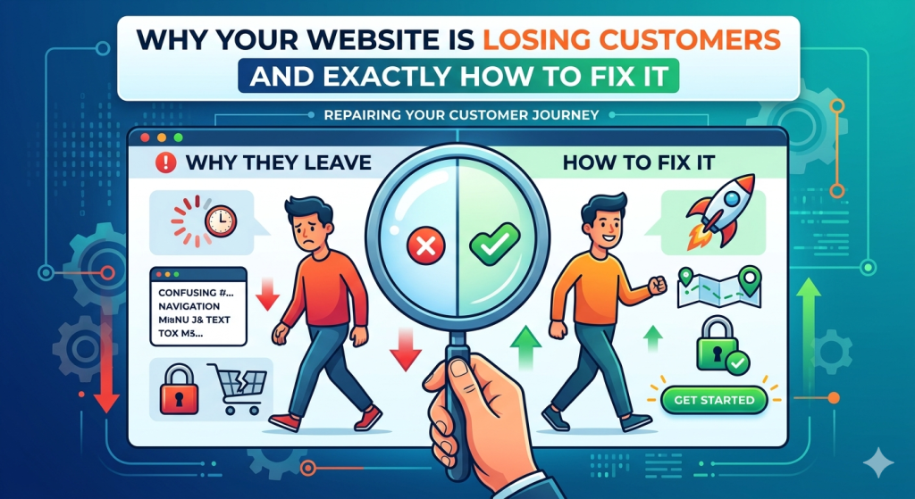
After auditing hundreds of business websites, we have found the same issues coming up again and again. They are not dramatic flaws — they are subtle friction points that compound. Each one nudges a small percentage of visitors toward the exit. Together, they can cut your conversion rate in half.
Here are the eight most common reasons websites lose customers, and exactly what to do about each one.
1. Your Value Proposition Is Not Clear in the First 5 Seconds
When someone lands on your homepage, they have one question: ‘Is this for me?’ If your headline does not answer that question immediately, most visitors will leave. Generic headlines like ‘Welcome to our website’ or ‘Empowering businesses through innovation’ tell the visitor nothing about what you do or why they should care.
Fix: Your above-the-fold headline should say exactly what you do, who you do it for, and what the benefit is. A strong formula is: ‘We help [audience] achieve [outcome] through [your service].’
2. Your Navigation Is Confusing or Overwhelming
Navigation menus with 10 or more top-level items, jargon-filled labels, and dropdown submenus three levels deep are a conversion killer. Users do not want to think. If they cannot find what they are looking for in a few seconds, they leave.
Fix: Limit your main navigation to 5 to 7 items. Use plain language that your customers understand, not internal company terminology. Put your most important conversion action — whether that is ‘Get a Quote’, ‘Book a Call’, or ‘Start Free Trial’ — in the top-right corner as a clearly styled button.
3. Your Site Is Slow
We covered this in our performance post, but it deserves a mention here too. If your site takes more than 3 seconds to load on a mobile device, a significant portion of your visitors will never see your content at all. Google PageSpeed Insights gives you a free performance score in under a minute.
Fix: Run your homepage through PageSpeed Insights right now. If you are scoring below 70 on mobile, performance work should be your next investment, not more marketing spend.
4. Your Calls to Action Are Weak or Missing
Visitors rarely take action spontaneously. They need to be told what to do next, clearly and confidently. If your contact page says ‘Feel free to reach out’ and your services page ends with no next step at all, you are leaving an enormous amount of value on the table.
Fix: Every key page should have one primary call to action — one. Multiple competing CTAs dilute attention. Use active language: ‘Get Your Free Audit’, ‘Start Your Project’, ‘Book a 30-Minute Call’. Make buttons a high-contrast colour that stands out from the page.
5. Your Content Is Written for You, Not Your Customer
A very common pattern: websites full of content about the company’s history, awards, and internal achievements, with very little about the customer’s problem. Your visitors are not primarily interested in you — they are interested in whether you can solve their problem.
Fix: Go through your website and ask, for every paragraph: ‘Does this help my customer understand that we can solve their specific problem?’ Reframe your services in terms of outcomes, not features. Replace ‘Our team has 15 years of experience’ with ‘We have helped 200+ companies reduce their infrastructure costs by 30%.
6. Your Site Does Not Work Properly on Mobile
More than half of web traffic is now mobile. If your website was designed for desktop and mobile was an afterthought, you are delivering a broken experience to the majority of your visitors. Common mobile failures include tiny text, buttons too small to tap, content overflowing off the screen, and popups that cannot be closed.
Fix: Test your site on a real phone, not just a desktop browser’s device simulation. Walk through the full conversion journey as a mobile user. Where does it feel awkward? Fix those points first.
7. You Have No Social Proof
Trust is the primary barrier to conversion on any website. People want to see evidence that others have worked with you and been satisfied. A website with no testimonials, no client logos, no case studies, and no reviews is asking visitors to take a leap of faith — and most will not.
Fix: Add at least three specific, attributed testimonials to your homepage and services pages. Client logos in a ‘Trusted by’ section are low-effort and high-impact. A single detailed case study showing a real result does more for your credibility than any headline.
8. Your Contact Process Has Too Much Friction
Long contact forms asking for company size, budget, project timeline, and three open-ended questions before a first conversation will dramatically reduce the number of enquiries you receive. Every additional field is an opportunity for a prospective client to decide it is not worth the effort.
Fix: For most businesses, a contact form with name, email, and a message field is sufficient for a first contact. You can gather everything else in the follow-up conversation. The goal of the form is to get the conversation started, not to qualify the lead completely.
Conclusion
None of these issues require a complete redesign to fix. Most of them are changes that can be implemented in days rather than weeks. Start with a quick audit: run PageSpeed Insights, walk through your site on mobile, read your homepage headline as if you know nothing about your business. What do you find?
Small improvements compounding across multiple touchpoints can meaningfully shift your conversion rate. You do not need more traffic — you need to stop losing the traffic you already have.